Kitchen design and what inspired me.
Oh kitchen, this kitchen design has been one year in the making. Figuring out the best layout for this space has been one of the trickiest. I had an idea for the design on my mind since the beginning but trying to make the space we had work was what took the most time to try to get right.
We knew from the get go that our budget was going to be limited, we couldn’t rework the whole kitchen or first level of our home, there are so many things we want to still remodel in this house like our bathroom ensuite and walk in closet which will be another big project, also finish the kids bathroom, etc. So we were very conscious about out budget and limitations. But still I wanted to make the most of this kitchen, I want this space to reflect the same vibe of our home.
Full kitchen view from the family room.
To explain a bit about the current first floor layout. The kitchen is in the middle of the main level and all the other spaces are connected to it. First thing you see when you get in the house is the kitchen at the end of the hallway.
From the “formal” dining room, there is a kitchen view. The kitchen also opens up to the family room, we have a semi open plan with an extension, like a “sun room” that we use as our everyday dining room and play room.
Family room view.
Dining room view to the kitchen.
If I can describe our home style I will say it’s a mix of traditional with eclectic and bohemian touches. I feel very inspired as well by English cottage style.
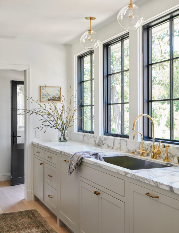
For this kitchen design I was very inspired by the following images.
From top left,
3. @landedinteriors
Bottom,
5. @Maggievollrath
For every project I like to start by creating a mood-board with all the elements and finishes I would like to use in the space. This way I can have a very clear idea of the design direction for a space before starting.
We are having Smeg appliances for the kitchen and I basically designed the whole kitchen around the gorgeous Smeg retro fridge. Smeg just launched a new larger cu.ft model that was perfect for our family.
For the cabinet color I am going with a pretty and timeless shade of green, its called Sage green light by Sherwin Williams.
Some of the finishes will be unlacquered brass for the faucet and shelf brackets, aged brass for the light fixtures and cabinet hardware from Rejuvenation.
For the floors we are doing the same herringbone wood floors from Monarch Plank that we have in the main living room/dining room.
Some of the other details are, thin brick for the fridge wall and Beadboard or Tongue and grove for the sink wall. An arched doorway from the dining room to the kitchen and wood beams.
Kitchen Mock-up
I am still deciding about countertops, I am between marble and soapstone, both timeless. Here are a few inspiration pictures I have saved since I started day dreaming about our kitchen remodel.
As seen on AD
As seen on Remodelista
As seen on Instagram
Image from Amber Interiors
@Heidicaillierdesign One of my current favorite designers.
Before and progress pictures coming up on the next post.
xx,
Valeria


