One day family room makeover with Castlery
*This Post is Sponsored by Castlery but all opinions are mine.
And the day arrived, after so much planning we were ready to go. We were going to do a room makeover in one just one day in our friend’s living room thanks to Castlery. To say we were so excited about this partnership is an understatement, nothing tops doing something special for someone else.
About the brand
Castlery creates furniture with great designs at accessible prices, without compromising on quality. Their designs feature a fusion of elements from mid-century to contemporary and are created in-house and in collaboration with award-winning international designers.
Castlery has a direct-to-consumer approach, by cutting out the middleman and keeping their inventory lean they can keep the costs down and extend savings to the customers.
Another great thing about the brand is that they offer free shipping on shipments of $999 and above, Free fabric swatches, 14-day return policy and Warranty coverage.
About the House
The Vega family have been living in their 60’s California ranch style house for almost three years. Between their jobs, life and their son, decorating their home wasn’t their top priority. They also felt overwhelmed and couldn’t figure out where to start.
I wanted to create a space that is beautiful and made for a family, practical and functional, layered but kid friendly.
The Before
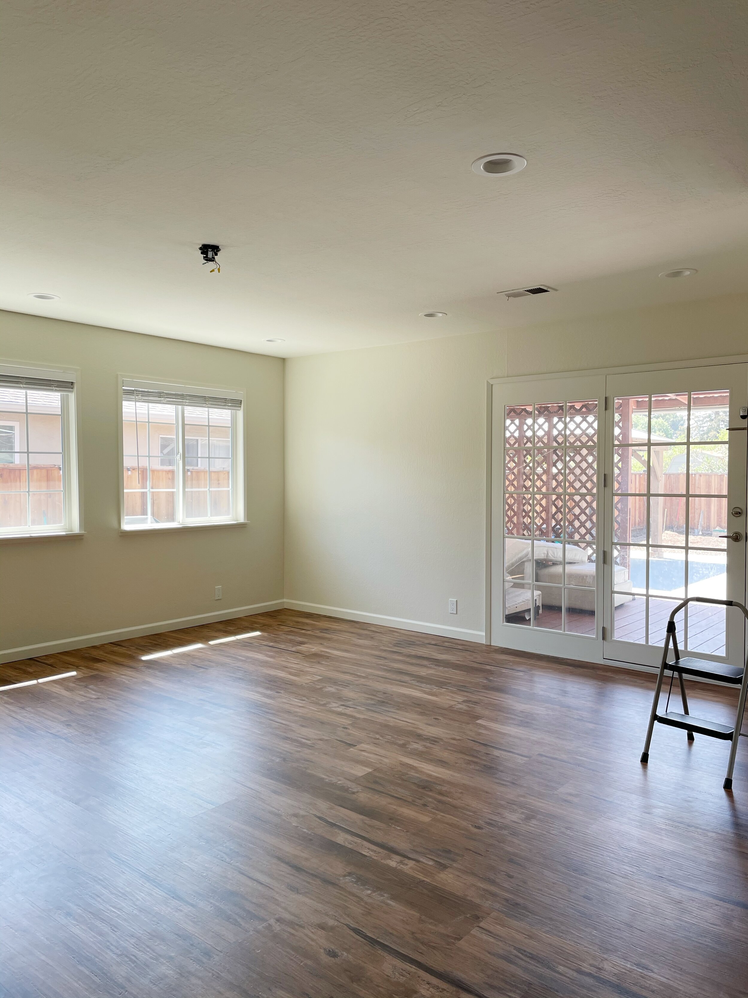
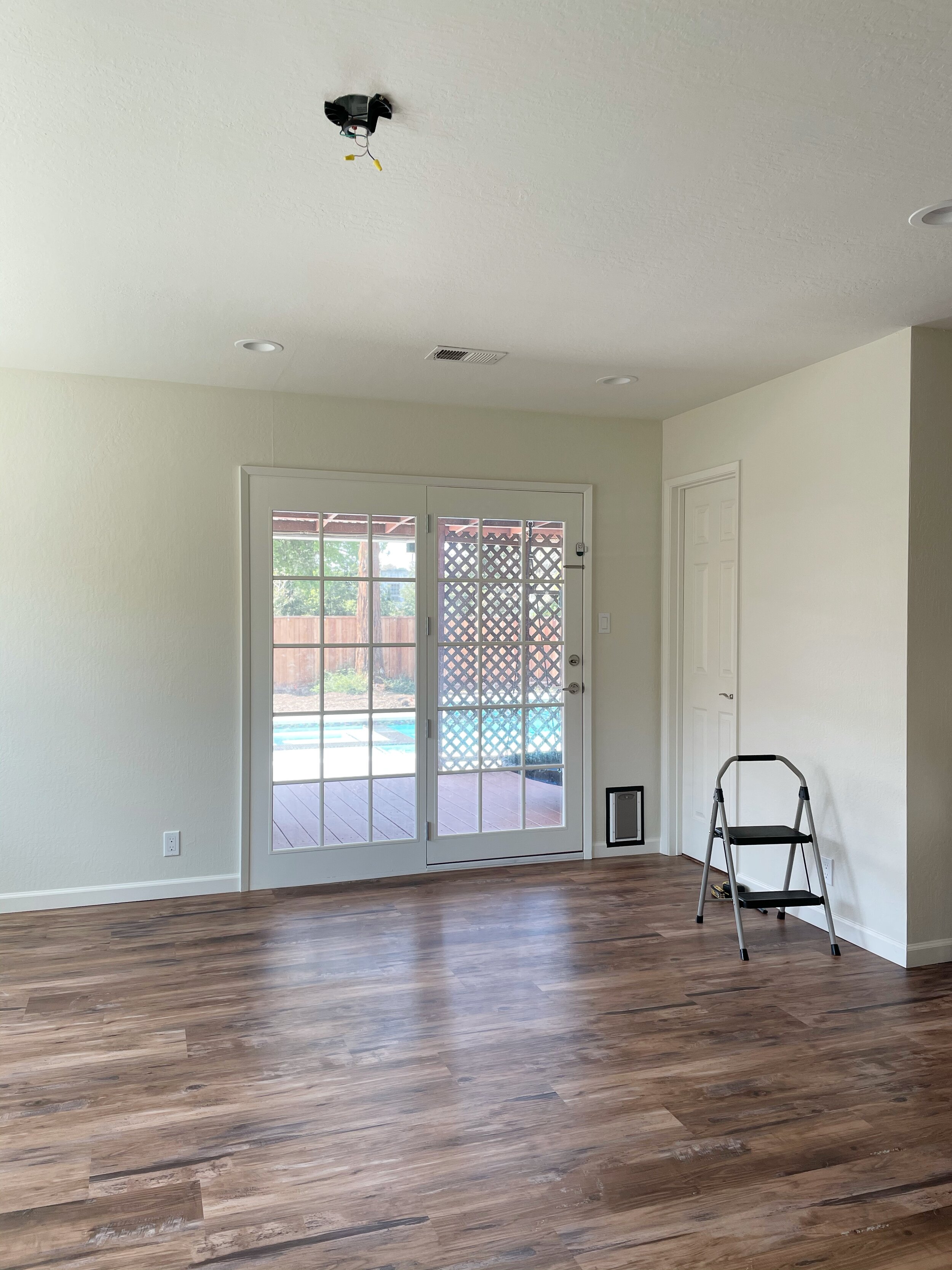
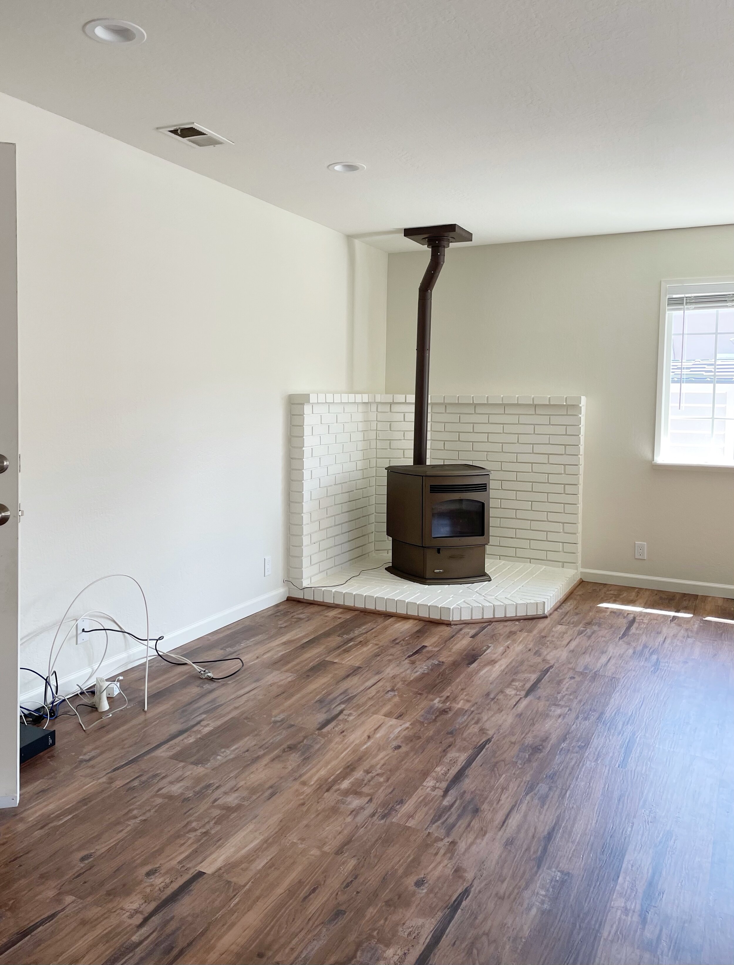
From these before pictures you can see that they didn’t have storage at all so that was a must from the get go. Also, more comfy seating spaces to hang out as a family and to welcome guests.
We started by removing everything from the space to have a blank canvas, including the ceiling fan since they didn’t need anymore to make space for a beautiful light fixture.
The design
They have a very active and happy little boy and this is their main living space so it had to be multifunctional and kid friendly. A space for all the family to enjoy with closed off storage for toys and everyday items.
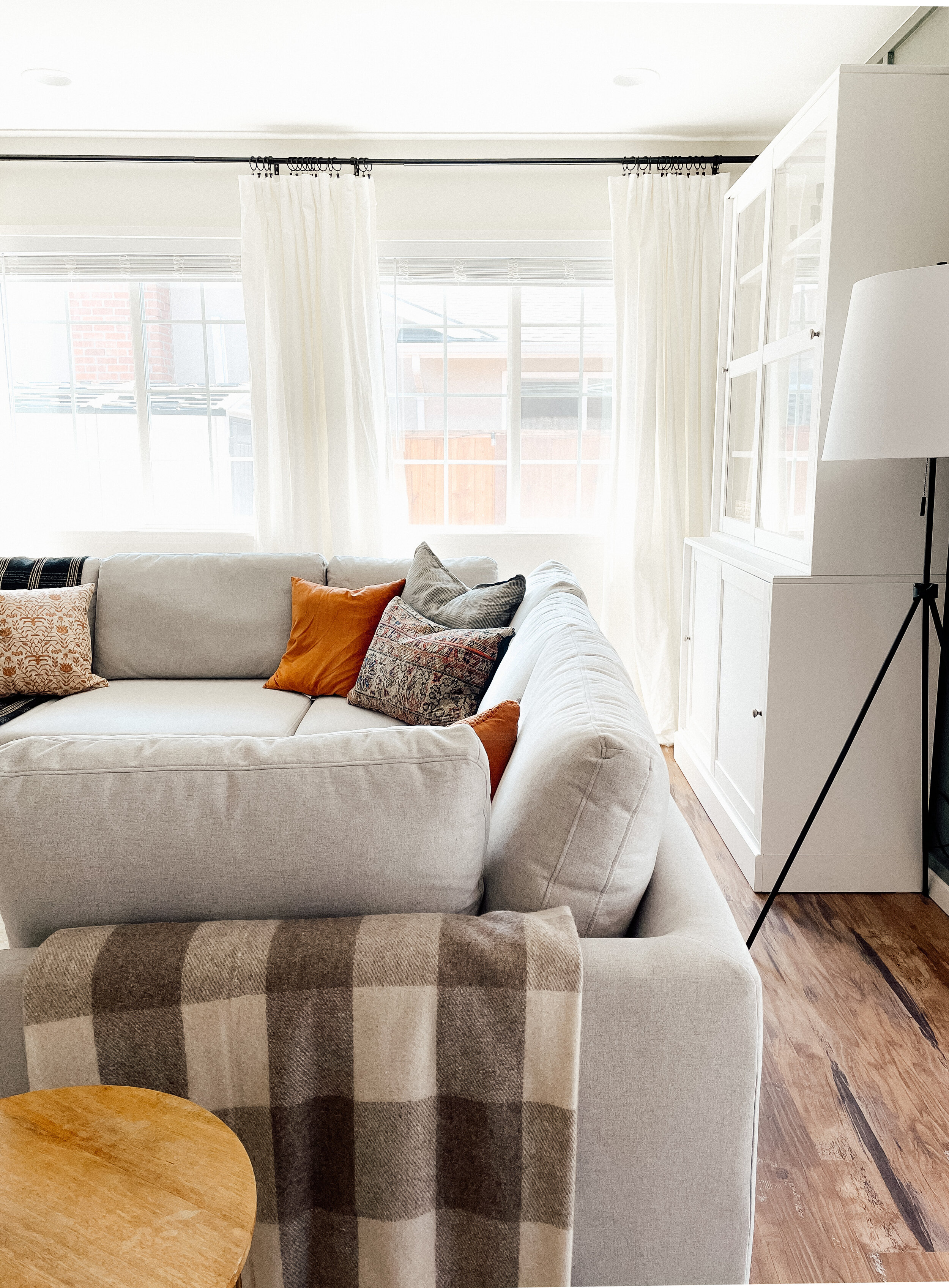
Usually when designing a space I pick a rug or the colors in a pillow as the starting point, but in this case I started with this gorgeous Adams L-shape sectional from Castlery, It had everything I was looking for, made to fit the whole family on movie nights, removable and washable covers which I consider a must if you have kids or pets and it is super comfortable and well made. I really like the light gray fabric, perfect neutral to have fun layering textures and colors with blankets and pillows.
For the media wall we chose this gorgeous August Tv stand, can you believe it is even more beautiful in person? it truly is. It adds so much character with its rich wood tone and slatted design and the gorgeous Italian Carrara marble slab top, so luxurious. Plus, It has plenty of storage to keep audio and media devices in order. Style meets function at its best. With just this piece of furniture were able to achieve such a beautiful visual impact on that family room wall.
The space was a blank canvas, we wanted to break all the white walls with an accent wall that complimented the dark floors, since we were keeping all the furniture and rug neutral this gave us the opportunity to bring some color to the walls. We went with a skinny board and batten wall from floor to ceiling in a beautiful custom shade of green.
This accent wall brought so much warmth, character and dimension to the space and gave us the perfect backdrop for all the beautiful furniture.
You can catch up on the making off this accent wall with color code here.
The Reveal
Putting this room together turned out better than we imagined.
All the furniture pieces fit like a glove and we were able to maximize and use it at its full potential, it looks even bigger doesn’t it? crazy to think that was possible with just a better furniture layout and the right furniture pieces.
We added more light sources to create cozier ambiance at night.
Family pictures instantly make a space feel like home.
Layering a mix of textures, patterns with Pillows and blankets for a lived in and welcoming look.
Curtains to dress up the windows. We installed one long rod to make the windows appear like one very large window instead of two smaller ones. We added two curtain panels on each section.


